Cheyney Thompson’s Colour Theory and The Relation To My Practice
mcarof
As I have navigated my work, painting and the use of colour, and how these are introduced by the making process when utilising digital and mechanical equipment has led me to investigate the work of Cheyney Thompson. I feel I don't have the time to scour all his work and will just be able to scratch the surface but this is all I need for now. Surface is a perfect introduction, as this is the space I am exploring in my practice, whether that be the surface of a mono-print or that of the laptop screen.
        Thompson's work looks like it could have been digitally reproduced with their similarities to a pixelated surface, so I'm intrigued to know how they are made and what rules drive the artist. The initial element I witness is the grid that is an element I am exploring in my work. The grid relates to the pictorial surface and this is the same with the work by Thompson. There is a relation to my practice where Thompson is concerned with the instruments associated with modern-day mass production rather than traditional painting. I always find it compelling that I tend to look to the work of painters when I classify myself as a printmaker. I acknowledge that my work is becoming heavily influenced by painting and the medium has also worked its way into my work. I feel there is an interesting conversation to be had with my positioning and allows me to have this conversation concerning the boundaries of print.
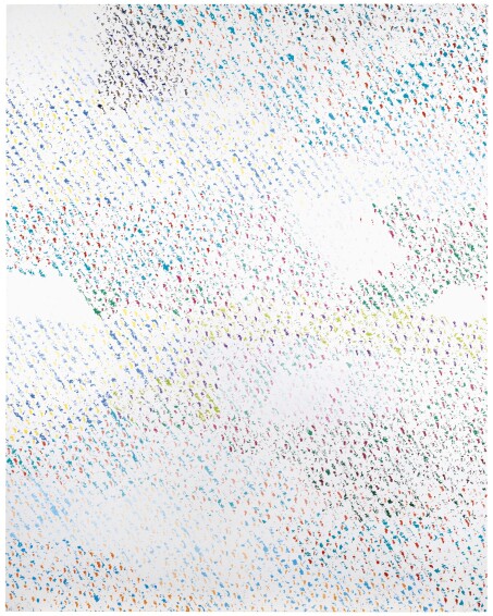
Study for Chromachrome, oil on canvas 2019
Back to Cheyney's work and it is fascinating to learn that the pattern is made from a magnified digital scan of the linen canvas. This is work not just about painting but about reproduction and is pertinent to the themes I am exploring  Much like with my work, the selection of colour is determined by a set of rules. With Cheyney's work, they are chosen according to the colour theories of artist-theorist Albert H. Munsell. With each colour prescribed to illustrate a particular time of day or night and the saturation determined by month, the flow of time is shown through traces of measurable effort, with luminous white representing the suns highest point in the sky and sharp black the darkness of night. The colours and hours between create a vibrant array of pulsating ripples, with luminous yellow contrasting against radiant azure. Therefore, what I can ascertain is that with Thompson's application of colour is restrained into a systematic rhythm which moves the work away from something aesthetic. This is how I am responding to the use of colour with my work, where the resulting colour from an experiment for example the orange that manifested in my scanner painting was then used as a swatch in order to apply colour to other works.
        I feel there is much to learn from Thompson's work with its direct correlation to my printmaking where the processes I employ, combined with that of the body of the machine and that of myself reference the dualities of the hand-made versus mechanical/digital production. I can sense a more systematic approach developing in my practice which I am keen to explore and will act as the next stage of my research after finishing my degree. There is a momentum in my work that I want to take advantage of to push my position in the printmaking sphere combined with the advancement and reliance on technology to form an exciting space to make further works.
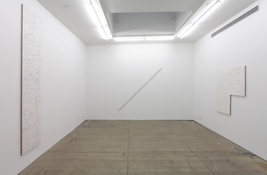
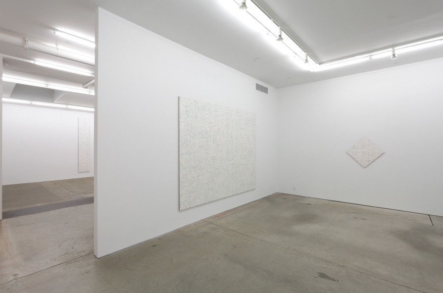
Robert Macaire Chromachromes, Andrew Kreps Gallery, New York, 2009 Robert Macaire Chromachromes, Andrew Kreps Gallery, New York, 2019

Leave a comment