
Today has been a successful printmaking session where I continued to work on my second 10m roll. Following on from my last post, the interpretation of the printer and the introduction of colour has been the focus for today. I have certainly given myself lots to do as was initially only going to produce one roll, however, as I am constantly driven by the making process, the concept has led me to make more.
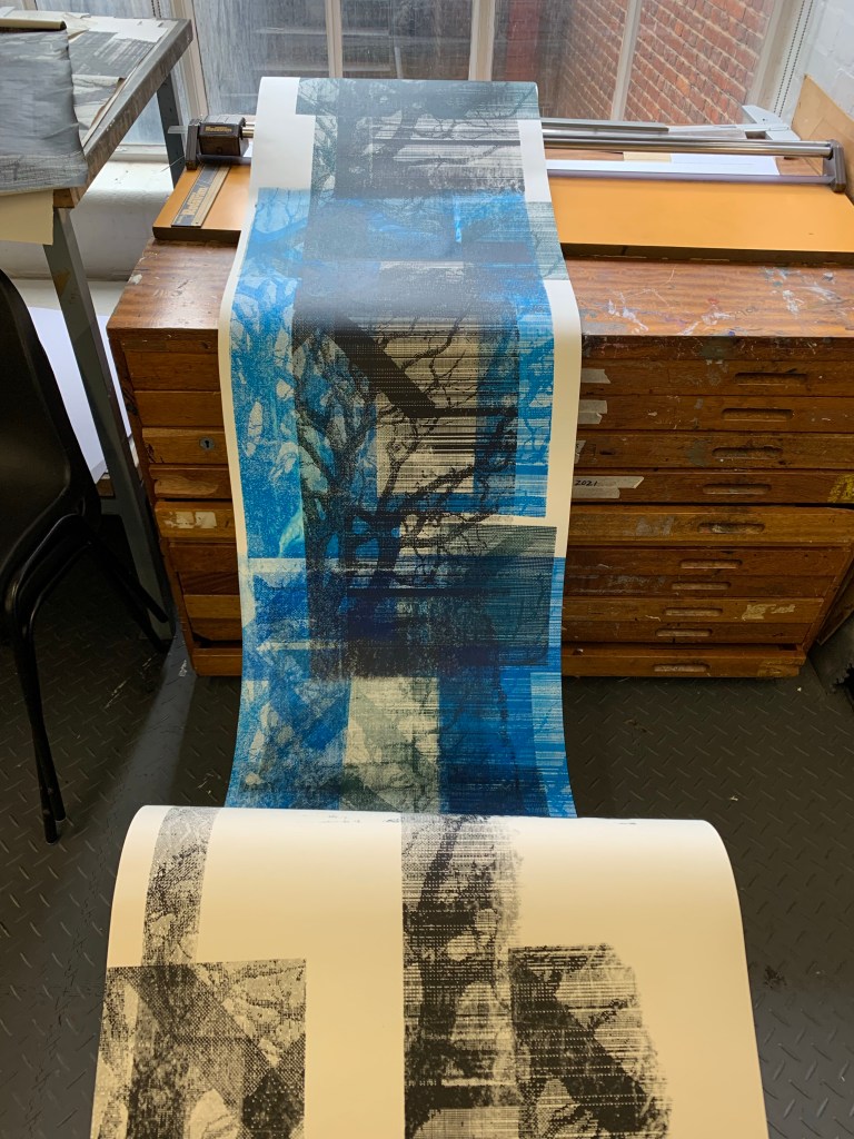
The previous roll was monochrome and where are started to consider mixing black from the CYMK rule. This second roll would now explore the colour components of this schema. I had already mixed the darker tone from all the colours - magenta, cyan and yellow, and was now going to work with each process colour individually. This was for me a great way to introduce colour, as when I consider my work critically, I tend to work using a monochrome palette and should explore the interactions between colour, however, I did not just want to add colour for the visual appeal. The main reason for this is that colour is not chosen for its aesthetic purposes but is introduced as a result of the making process and how its use relates to the concept of the work.
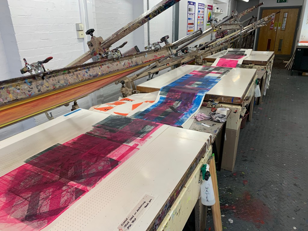
The involvement of colour in the work has given the piece a totally different fell, where there are now far more saturated colours.
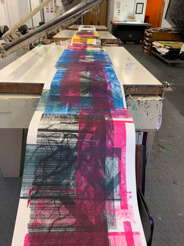
This work makes me think back to the conversation with my tutor Nicolas de Oliveira where we discussed the work of Richard Hamilton. The blocks of colour reminded me of the floating sheets in the exhibition and how they presented nothing but the process of interaction in the gallery space and that of the viewer. As I have stared previously, the work is becoming less about what it looks like in. terms of imagery and the aesthetic value but about the making. I consider how this work would look if I removed the tree image totally and just used blocks of colour - I'm nit sure if this would be another aesthetic decision?

Leave a comment