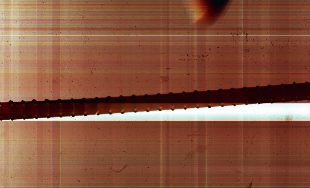
I booked out a flatbed scanner in Photography so I could experiment with scanning the light in the room. By adjusting the DPI I could achieve different results which I was eager to explore. I call the above scan a scanner painting as it was scanning the conditions of the room, where I then intervened and placed a leftover cardboard packaging strip before the scan took place. This was a collaboration between me and the scanner, inspired by my screen printing tests where I was masking out areas with strips of card. I was trying to create the grid that appears in my work and when I am working with the various digital devices I employ. I had an incline that if I ramped up the DPI of the scanner the grid would eventually appear. In order to achieve colour the scanner had to be left open in order to scan the light of the room. This was an interesting concept to me as I was in essence taking a print of the room at that time. The above image took 30 minutes to scan with a setting of 1600dpi.
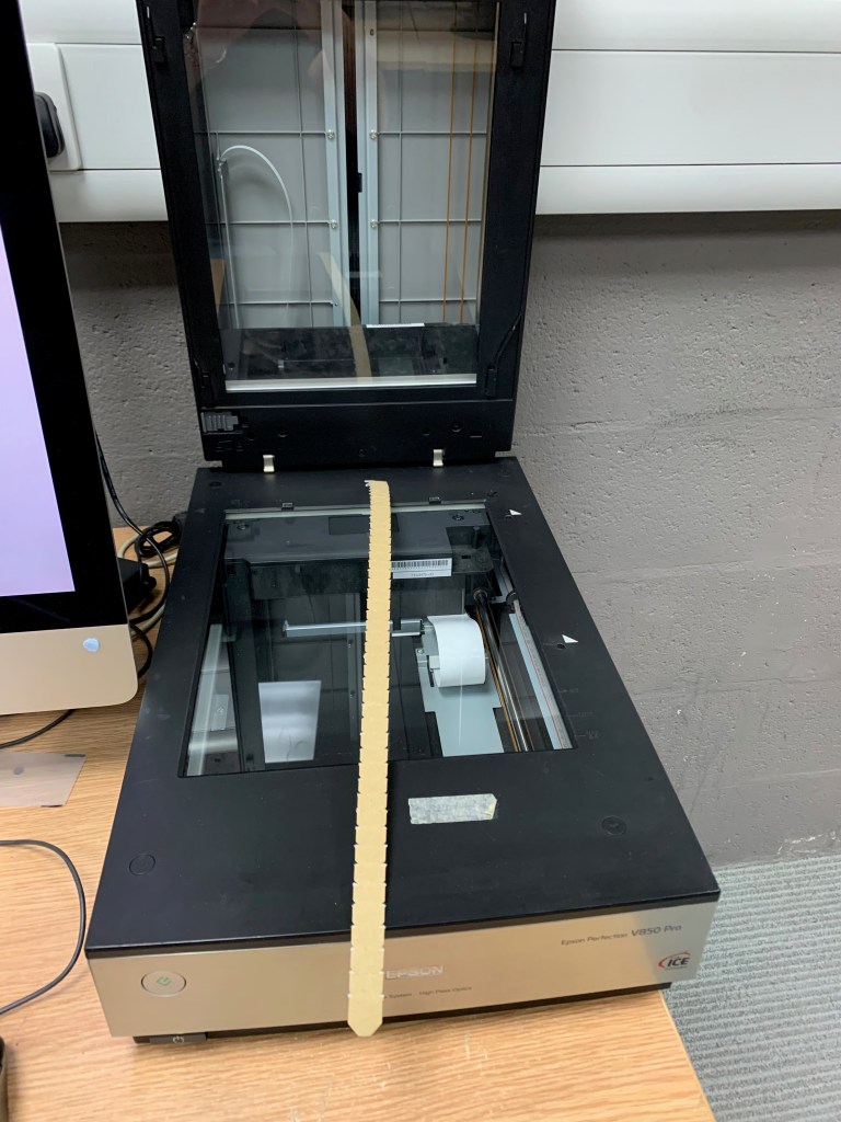
Scanner ready to scan with cardboard packaging strip
There was a great amount of depth to the scan, which became more enticing as I focused in on areas of the image. There were marks appearing and impressions of dust particles being caught in the scanning process. The contrast between the orange and the white gap left from scanning the cardboard strip provided a focal point to the composition. There was much more going on in the way of colour, from green to blue lines streaking across the image. This was a particular piece of work I was discussing with Rebecca Edwards, Curator at Arebyte. This was following the first round of test exhibitions we had that I found extremely productive. A particular point that came out from the conversation was my fascination with the pixel, attempting to identify the language that was creating effects in particular sections. Through our exchange the idea of colour surfaced. Rebecca particularly liked the green tone in the image; Rebecca said "I really like that colour, wouldn't it be great if you could zoom in on that". My imagination was ignited and we got talking about pixels and hex codes. In Photoshop you can zoom in, down to the individual pixels and identify the hex code marker of a pixel. I had to do more with this and thinking of my process working between the digital and physical, I proceed to identify the hex code and see if I could get the colour mixed.
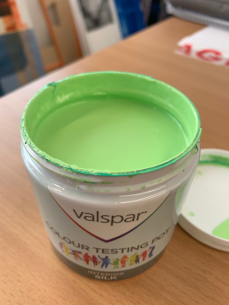
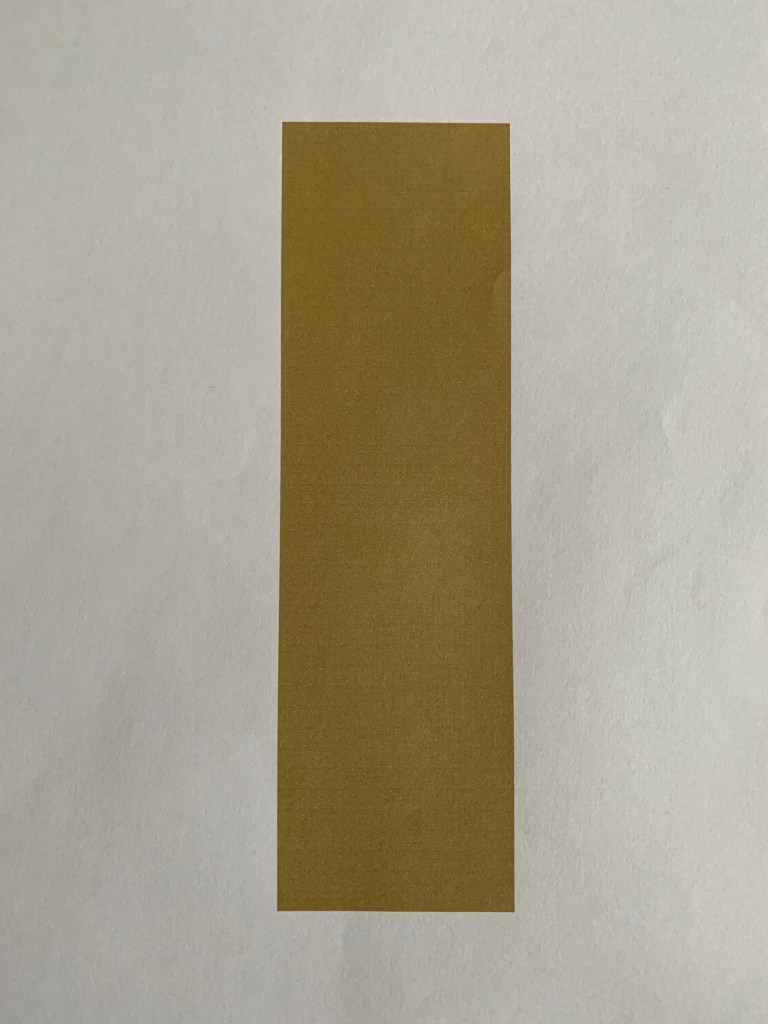
Section from scanner painting taken from PhotoshopIsolated colour from pixel, hex code #CFFF6APaint mixed from hex code Paint mixed from hex code
I went to B&Q to see if I could get the colour mixed using their Valspar paint mixing service. The process is quite simple, where you take a sample of the printed colour and they will scan and mix the paint accordingly. Unfortunately, when I tried to print the above colour sample using my home printer the colour printed totally different and looked more like a brown. The ink levels were fine on my printer but the device was clearly interpreting the colour in a different way. This mishap was still of use to me as identified with my thoughts on how different devices interpret and subsequently print in a different way. These unique markers are something I love to focus in on in my practice. There was not the facility to print directly from the hex code so we went about trying to mix the colour from an image on my phone and the colour cards in store. We we're able to achieve an accurate interpretation of the colour and led me to further consider how I am trying to interpret the digital. This is now becoming a core concept in my work in terms of how I am personally trying to mimic what is happening digitally.
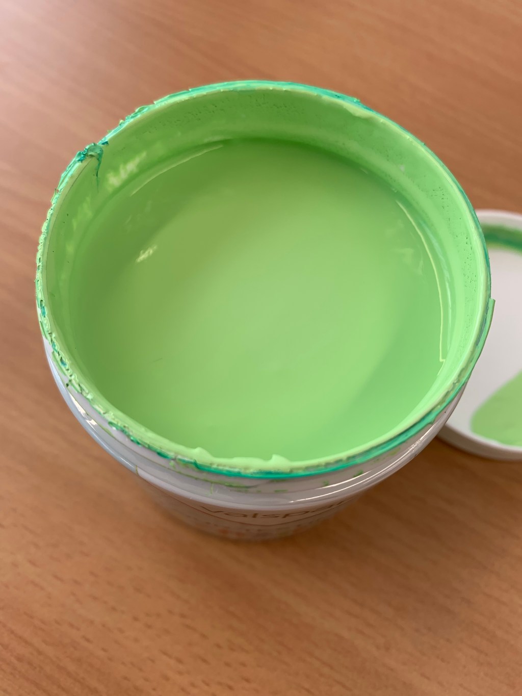
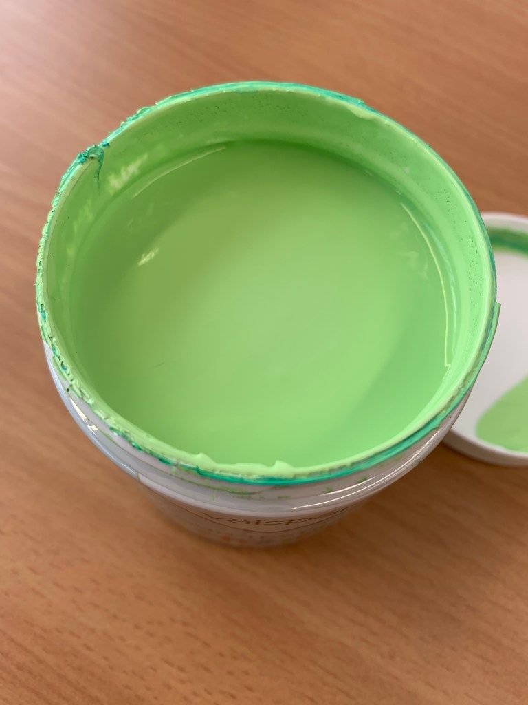
Another important aspect is how this all manifests? I now have a tester pot with this mixed pigment directly interpreted from a digital source. Is this a print? I like to question what a print can be, is it not just an impression taken from something else? I like this conceptual facet to my interpretation of print and how it spurs on new possibilities for work. I now have a new material I can incorporate into further work and the colour has not been chosen for aesthetic purposes (this would not align with my practice) but as a result from the making process.


Leave a comment